Candlestick charting has been around for centuries and has become an increasingly popular tool for traders and investors alike. This guide will take you through everything you need to know about candlestick charting, from its origins and history, to the anatomy of a candlestick, to how to use candlestick charts in trading. By the end of this guide, you will have the knowledge and skills needed to analyze and interpret candlestick charts, and make informed trading decisions.
Origins and history of candlestick charting
The origins of candlestick charting can be traced back to Japan in the 18th century. The Japanese developed a method of charting the price of rice, which later became known as the candlestick chart. The method was later introduced to the western world in the 1990s and has since become a popular tool for traders and investors.
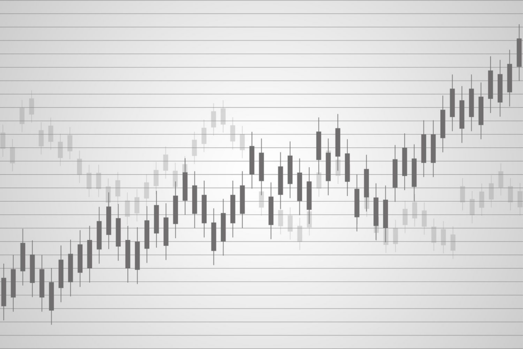
The idea behind candlestick charting is to represent price movements in an easily understandable way. Each candlestick represents a specific time frame, such as a day, a week, or an hour, and shows the open, high, low, and close prices for that time frame. The body of the candlestick represents the range between the open and close prices, while the wicks, or shadows, represent the range between the high and low prices.
Candlestick charting is based on the idea that price movements are not random, but rather follow patterns that can be analyzed and interpreted. By understanding these patterns, traders and investors can make informed decisions about when to buy and sell.
Anatomy of a candlestick
To fully understand candlestick charting, it’s important to understand the anatomy of a candlestick. A candlestick is made up of three parts: the body, the upper wick, and the lower wick.
The body represents the range between the open and close prices. If the candlestick is green, the open price is at the bottom of the body, and the close price is at the top of the body. If the candlestick is red, the open price is at the top of the body, and the close price is at the bottom of the body.
The upper wick represents the range between the high price and the top of the body. The lower wick represents the range between the low price and the bottom of the body. The length of the wicks can vary, and can provide important information about the strength of the trend.
Understanding the anatomy of a candlestick is crucial for interpreting candlestick patterns and making informed trading decisions.
Candlestick chart patterns and their meanings
Candlestick chart patterns are formed by the arrangement of one or more candlesticks on a chart. These patterns can provide important information about the direction of the trend and can help traders and investors make informed trading decisions.
There are three types of candlestick patterns: bullish, bearish, and indecision.
Bullish candlestick patterns
Bullish candlestick patterns are formed when the price is trending upwards. These patterns can indicate that the trend is likely to continue, and that buying may be a good option.
One example of a bullish candlestick pattern is the hammer. The hammer is formed when the price opens near the low of the day, and then rallies to close near the high of the day. The long lower wick indicates that the price was pushed down, but then buyers took control and pushed the price back up.
Bearish candlestick patterns
Bearish candlestick patterns are formed when the price is trending downwards. These patterns can indicate that the trend is likely to continue, and that selling may be a good option.
One example of a bearish candlestick pattern is the hanging man. The hanging man is formed when the price opens near the high of the day, and then sells off to close near the low of the day. The long lower wick indicates that the price was pushed down, but then buyers took control and pushed the price back up.
Indecision candlestick patterns
Indecision candlestick patterns are formed when the price is not trending strongly in either direction. These patterns can indicate that the market is uncertain, and that caution may be warranted.
One example of an indecision candlestick pattern is the doji. The doji is formed when the open and close prices are the same, or very close to the same, creating a small body. The long wicks indicate that there was volatility during the day, but that the price ultimately ended up where it started.
Candlestick chart indicators
Candlestick charting can be used in conjunction with a variety of indicators to provide even more information about market trends. These indicators can include moving averages, trend lines, and oscillators.
Moving averages can help to smooth out the price data and provide a clearer picture of the trend. Trend lines can be used to identify support and resistance levels, which can help traders and investors make informed decisions about when to buy and sell. Oscillators can provide information about overbought and oversold conditions, which can be used to identify potential trading opportunities.
Using candlestick charting in conjunction with these indicators can provide a more complete picture of market trends and can help traders and investors make more informed trading decisions.
How to use candlestick charts in trading
Candlestick charting can be used in a variety of trading strategies, including day trading, swing trading, and long-term investing. The key is to identify patterns and trends that can be used to make informed trading decisions.
One common trading strategy is to use candlestick patterns to identify potential trend reversals. For example, if a stock has been in a downtrend, but then forms a bullish candlestick pattern, this may indicate that the trend is likely to reverse, and that buying may be a good option.
Another strategy is to use candlestick patterns in conjunction with other indicators to confirm potential trading opportunities. For example, if a stock forms a bullish candlestick pattern, but is also trading above its 50-day moving average, this may be a strong signal that buying is warranted.
Common mistakes to avoid when using candlestick charts
While candlestick charting can be a highly effective tool for analyzing and interpreting market trends, there are some common mistakes that traders and investors should avoid.
One mistake is to rely too heavily on candlestick patterns without considering other factors, such as volume and price action. It’s important to look at the bigger picture and consider all available information when making trading decisions.
Another mistake is to become overly focused on finding patterns and trends, and ignoring risk management. It’s important to always manage risk and use stop-loss orders to protect against potential losses.